Color Temperature for Lights: 2700K to 6500K Uses
After brightness, color temperature is the most quoted spec on a creator light — and the most misunderstood, by buyers and end customers alike. A number in Kelvin promises nothing about quality; it describes where the light sits between candle-warm and sky-cool. Knowing what each band actually does, and which configuration to stock, turns a jargon spec into a selling and support advantage.
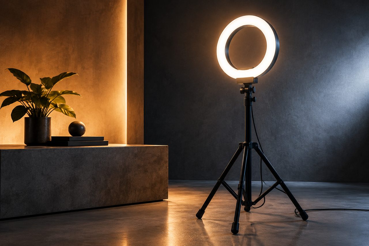
The stakes are concrete. Skin that looks healthy in one light looks gray in another; a product shot shot under the wrong lamp needs a reshoot; a streamer whose key light fights a window spends every session explaining why the white balance looks odd. Most of these outcomes trace back to one number chosen or marketed carelessly. For a reseller, the payoff for understanding the scale is twofold: listings that set honest expectations, and a product line where the default recommendation almost sells itself.
A vocabulary note for listings: color temperature and brightness are independent axes. A 2700K light can outshine a 6500K unit; neither number substitutes for the other. Listings that fold both into one vague claim — "bright warm light" — create the mismatched expectations that later become returns. The discipline is to state them separately: the band in Kelvin, the output in lumens or lux at a stated distance, and rendering as its own figure.
What the Kelvin number describes
Color temperature, abbreviated CCT for correlated color temperature, describes the apparent color of white light on a scale measured in Kelvin. The counterintuitive part is the direction: lower numbers are warmer, drifting orange like a candle at 2700K or a household bulb near 3000K; higher numbers are cooler, drifting blue like an overcast sky near 6500K. Neither end is "better". They are different defaults: warm light reads cozy and evening; cool light reads clinical and bright; the middle reads neutral.
Two properties of the scale matter commercially. First, the eye adapts — a warm lamp looks normal within minutes, which is why buyers judge lights in photos rather than in person, and why the on-camera result is the honest one. Second, light mixes: a creator with a warm ceiling bulb and a cool key light will produce footage where one of the two is fighting, and no amount of settings fixes a genuinely mixed scene elegantly. Both properties push buyers toward adjustable lights, which is a stocking insight before it is a technical one.
The practical bands, and where each earns its place
| CCT band | Visual character | Best use | Cautions |
|---|---|---|---|
| 2700-3000K warm | Candle-to-incandescent orange-leaning white | Cozy vlog setups, evening moods, warm interior scenes | Harder skin rendering on standard settings; rarely right for product shots |
| 3500-4000K neutral warm | Soft, gently warm white | Living-room studios, lifestyle content with household lighting | Can look dull if the room's own bulbs are cooler |
| 4000-4500K neutral | Clean, office-style white | Talking-head streaming, work-from-home setups, tutorials | The safe middle; mismatches stylish warm interiors |
| 5000-5600K daylight | Bright, slightly cool daylight white | Windows in frame, daytime shooting, beauty content | Reads cold at night in a warm-lit room |
| 6000-6500K cool | Blue-leaning white | Tech product shots, cool-toned scene styling, accents | Clinical on skin; the most common "why do I look gray" culprit |
Read as a merchandising map, the table says something simple: the defensible center of the market is 4000-5600K, the edges are mood choices, and anything sold as a single fixed point should state its band plainly so the buyer self-selects correctly. Regional taste nudges the center slightly: markets with warm domestic lighting traditions tolerate warmer keys, while office-dominated rooms pull toward neutral. Samples should therefore be judged in the destination market's typical room, not in a blacked-out studio, because the room is the second light source in every frame.
Fixed, bi-color or RGB: the stocking decision
The band table collapses into a configuration choice. Fixed-temperature lights are the value end: one band, lowest cost, honest as long as the listing names the band. Bi-color lights sweep roughly 2700-6500K and have become the default recommendation for good reason — one SKU covers the whole table above, adapts to mixed rooms, and answers the "looks different on camera" support ticket with a dial instead of a paragraph. RGB lights add hue control for accents and background styling; they are a creative layer, not a key-light substitute, and they sell best as a second light in a setup rather than the first.
For a catalog, the proportions follow the audiences: bi-color as the lead SKU in every size class, fixed units only at aggressive price points where the band is a feature worth stating, RGB as the attach product. A bundle that pairs a bi-color key light with a small RGB accent covers both the serious and the playful buyer without stretching either claim.
The spec buyers forget: color rendering
Two lights can share a Kelvin rating and still render skin completely differently, because CCT says nothing about how completely the light covers the visible spectrum. That coverage is measured as color rendering — CRI in photography usage, with the related TLCI figure used for television cameras — and it is the difference between a face that reads healthy and one that reads off in a way viewers sense but cannot name. Value-tier lights with poor rendering are the quiet engine of "the light makes me look sick" reviews, which land on the listing rather than on the physics.
The commercial discipline is symmetric. Stock lights whose rendering figures survive a sample test on real faces — several skin tones, on camera, not just to the eye — and state the rendering figure in the listing once it is known. When a supplier's spec sheet omits the rendering figure, measure it in sampling rather than trusting the silence; the omission is itself a data point about the light's spectral quality. A claimed band without a rendering figure is half a spec, and the half that is missing is the half that drives returns.
A listing checklist for color temperature
- State the CCT as a range or a band name, never as a vague "warm white" without a number.
- Publish the color-rendering figure once verified; it is the single best differentiator in a crowded lighting shelf.
- Say what the light is for: "daylight key for window-side desks" outsells "6500K LED panel" because it places the product in a scene.
- Warn about mixing: a note that the key light should match the room's dominant bulbs pre-empts the most common disappointment.
- Photograph the same subject at both ends of the adjustment range for bi-color units; the two-frame comparison is the honest demo and the best-converting image on the listing.
- For fixed-band SKUs, name the band in the title so mismatched expectations never reach checkout.
- For kits, note which end of the adjustment range the hero photo used, so buyers can reproduce the look they saw.
The sourcing bottom line
Color temperature is not a hard spec; it is an honest one. Stock bi-color as the default, keep the band visible in every listing, verify rendering on real faces before volume, and the category's most common returns quietly disappear. Current lighting models ship from a single piece for validation through dropshipping, with stock dispatched within 48 hours. Logo and packaging customization starts at 500 pieces per SKU and full OEM at 1,000 pieces, with sampling in 5-7 days for light customization; see the OEM/ODM page and the creator gear category page.
FAQ
Is a higher Kelvin rating better for creator lights?
No. Kelvin measures warmth or coolness, not quality or brightness. Around 6500K reads cool and clinical indoors, while 4500-5600K tends to flatter skin and blend with daylight. The right question is which band matches the room and the content — which is why bi-color lights spanning roughly 2700-6500K are the default catalog recommendation.
What color temperature should a streamer or vlogger use?
For indoor talking-head content, 4000-5000K is the dependable zone: professional without looking cold. With windows in frame, shift toward 5000-5600K so the key light matches daylight. Warm 2700-3000K suits cozy evening setups but makes skin rendering harder and rarely suits product shots.
Why does the same light look different on camera than in the room?
Two factors: the camera's white balance averages scene colors, so a cool lamp in a warm room looks bluer on camera; and color rendering differs between lights that share a Kelvin rating, because the rating says nothing about spectral quality. Stating the CCT range plus the rendering figure — and warning about mixed lighting — preempts most of the resulting returns.